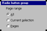
Radio button groups
A radio group consists of a set of toggle-type buttons of which the operator must select one, and one only. The buttons form a set of mutually exclusive choices; selection of a radio button automatically deselects the button that was previously checked.
Radio buttons are always grouped.
A radio group is defined within the braces of its parent window, using the following form:
To select a button to be checked initially, allocate it the style flag WS_CHECKED. If more than one button in a radio group is allocated this flag, one is checked and the others ignored. See Button style.
The runtime checked property can be used to change (or retrieve) a button’s state at run time, e.g.:
button_id->checked = TRUE
A radio button may be linked to an integer type field which stores the button’s current state (checked/unchecked) and may be used to update it. See Button linked field.
RELATED TOPICS |
