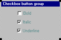
Checkbox button groups
A checkbox group is a group of buttons, each with a toggle-type action. Each button may be checked or unchecked at any moment. When a button in a checkbox group is pressed, its state changes from selected to unselected, or vice versa. The checkbox style is particularly suitable for choices that are related but not exclusive. The buttons normally form a logical set of two-way options all relating to the same process, such as selecting a print style.
Checkbox buttons are always grouped, though the group may consist of only one button. Any combination of button states is valid. A checkbox button can be initially checked or unchecked, and its state can be changed in the program code.
A checkbox group is defined within the braces of its parent window, using the following form:
By default, checkbox buttons are initially unchecked. However, a checkbox button may be created checked by specifying the style flag WS_CHECKED in its definition, and may be modified by the statement button_id->checked = TRUE|FALSE at run time. See Button style, Button checked clause
A checkbox button may be linked to an integer type field which stores the button’s current state (checked/unchecked) and may be used to update it. See Button linked field.
A column of cells in a table may be assigned the checkbox type. See Table cell properties.
RELATED TOPICS |
